Argentine Wine Needs Concept
In the competitive wine market the need to communicate concepts through label design is essential. Labels must capture the consumers’ attention and seduce them.
Opinion Space
- Comments:
- 0
- Votes:
- 2
- ES
Consumers have become more selective and careful when choosing wine, thus the label message needs to be very clear and precise, since the graphic design conveys its values. Nevertheless, if a label design seems more expensive that its actual price, it could be considered deceitful. It happens exactly the same when a wine is more expens
Argentine wine is known throughout the world by its high quality. However, twenty-five years ago, the local market was very different and so was the social recognition inside Argentina. Nowadays there are many kinds of consumers, and a wide variety of price ranges, from entry-level to ultra-premium wines for the most exigent drinkers.
In order to have a better understanding about the changes that the market has suffered lately, it is important to know about its history. Wine is part of the Argentine culture and has always been present when family and friends get together. Twenty years ago choosing a bottle of wine was a simple task, as there were only red or white wine, and big bottles of 5L (known as damajuanas) were very popular. At that time, wine was usually diluted with sparkling water, so the quality of the product was not very important for most consumers.

Argentine tradition
The market has evolved remarkably in the last few years when a wide diversity of varietals, such as Malbec, Cabernet Sauvignon, Syrah, Chardonnay wines were launched. This segment is well established and today it is stronger than the classic red and white wine. When wine became fashionable, traditional consumers learnt more about wine tasting. Moreover, there was a massive interest in wine from new consumers that were more open to new varieties.
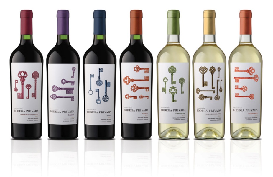
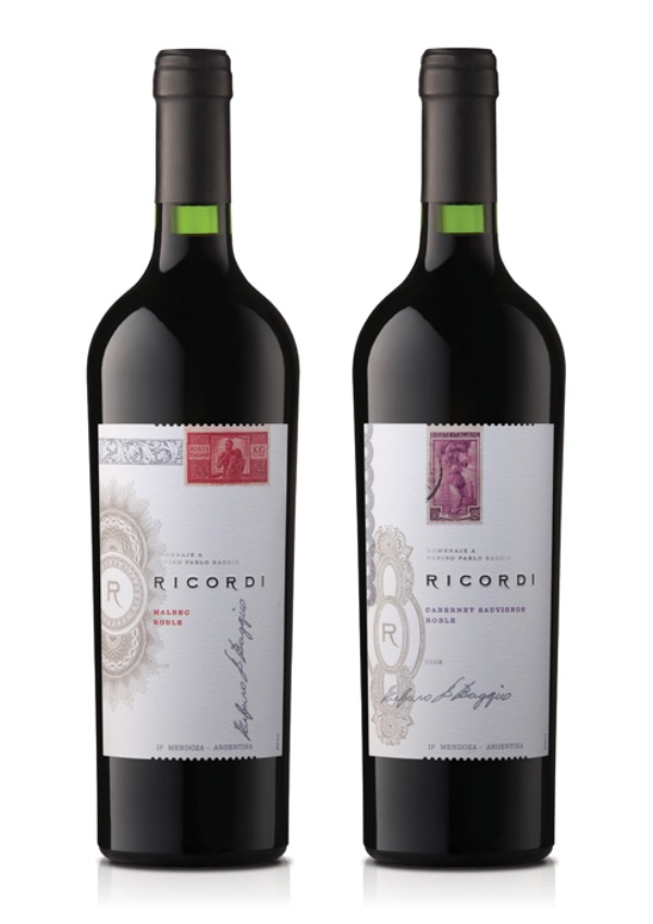
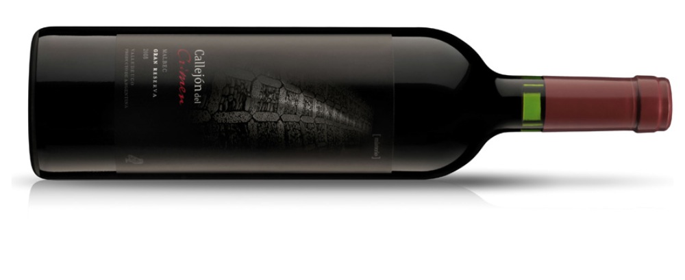
The graphic style of the Argentine wine labels has always been influenced by the heritage of the Old world wines, coming from European tradition. The presence of classic typography and sober designs is their most remarkable characteristic. The traditional and conservative style has given way to a contemporary graphic language. In that sense, the Argentine wine market is rather conservative compared to other new world producers.

What´s your story?
In the cases when a brand does not have a story, it is needed to create a BrandStory. That means to create a story conceived to fulfil the brand strategic objectives. Having defined the BrandStory, the next step is to find the most suitable concept and graphic universe that will help to tell that story. Design is the one that will translate graphically what the brand wants to convey. Every detail needs to be conscientiously thought; typography, colour, paper texture, metallic foils, gloss spot and emboss. Every design element must be applied to make a bold and strong brand statement and to achieve shelf impact.
Wine labels are not only elegant logos and nice graphics. Wine brands are built on their values and on the way their consumers feel connected with them. This is why it is so important to define an own BrandStory, a concept that defines the product. This is the key for the brand development, to make it be authentic and stand out among the others. The absence of concepts leads to a generic label, a graphic template with no personality, without direction. It is not possible to design a wine with personality, without having a clear idea of the brand message to convey.

Specialized Training
Complement your vision with structured training. Our courses provide the technical and strategic tools that the current market demands.
View Academic OfferShare
Please value the editorial work by using these links instead of reproducing this content on another site.

Topics covered in this article
What do you think?
Your perspective is valuable. Share your opinion with the community in the discussion.
Comment now!


