Healthy Food has Changed Packaging Design
Since nutritional information became important and popular concern about it grew dramatically, many food brands have foreseen this as an opportunity to build their identity.


Editor's Selection
- Comments:
- 5
- Votes:
- 11
- ES
Nowadays, more and more packages show information on their main panel about caloric values, or other important product features, such as quantity of calcium they provide. Consequently, brands created a new way to talk to consumers. In Tridimage, we daily receive Briefs requesting this kind of communication. The new generation of healthy foods and beverages has changed the visual codes of packaging design.
Due to the massive and quick access to all kinds of information people have remarkably increased their interest in health care. Consumers have changed and brands have changed too. The awareness of nutrition quality nowadays is very different from the one we had many years ago, when cholesterol seemed irrelevant or as if it did not even exist. Therefore, there is a preference for products that promote healthy nutrition and wellbeing.
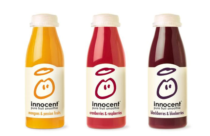
Foods and beverages are part of our daily life. In this way, we define our consuming habits every time we choose a product instead another one. The graphics, shapes, colours and materials of every package create the identikit of our daily choices. Packaging Design is leading a revolution in the habitual landscape on the shelves and it is changing and keeping pace with the market. The increasing presence of white background, opaque non-shining materials and simple logotypes are the most popular characteristics of the «healthy» category. Evidently, these changes are having a deep impact on the visual culture that surrounds us.
Defying the rules
As the market changed, new structures and typologies of communication were created through Graphic and Structural Design. Old paradigms were renewed and categories were redefined. The challenge of the new era is to create products that look as if they do not want to be sold, designs which break the rules and defies the laws of tradition. Creativity has really become a basic need. How many possible ways there are to convey the «natural origin» of a product? Originality is essential to stand out among the vast quantity of competitors. Luckily, consumers are savvy and more perceptive about design, and they really appreciate innovation and, progressively, many design resources, that were unacceptable in the past, have turned totally valid today. Graphic and Structural Design are highly appreciated and add value to the brand.
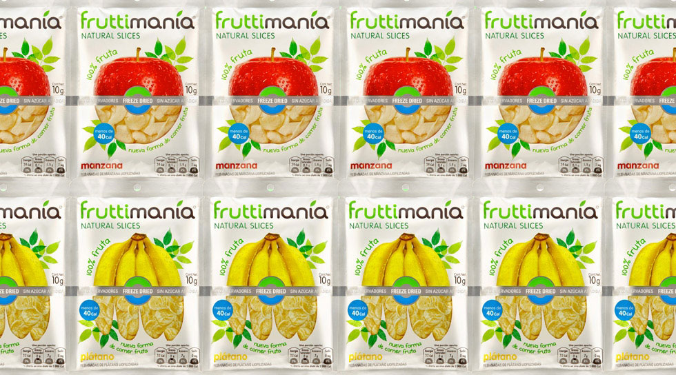
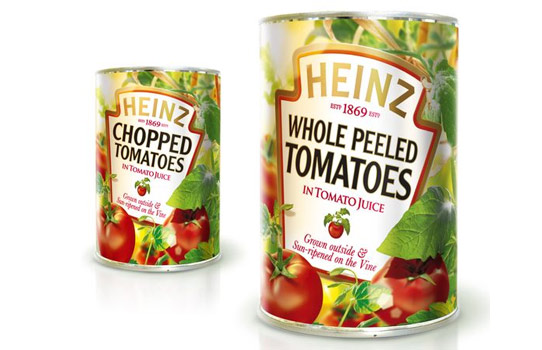
One of the main points of the new packaging design paradigms is to expose explicit realism; they do not want to look as what they are not. For this purpose, designers and marketing teams need to reconsider many graphic resources that were well established in traditional packaging design. For example, the undulating shiny ribbons, the ostentatious superhero logotypes full of glitter and perfect illustrations of flawless fruits and vegetables that even looked as if they were out of this world, are no longer the object of desire of new consumers. The illustration or photograph should look as real as possible. Imperfection is considered an honest brand attitude.
The rise of «Light» brands
Twenty years ago, low-calorie or fat-free products (called Light products) were a huge success for all those who were worried about overweight. Generally, the graphic design of those products was not very attractive and quite dull. They used to be related to restrictive diets and did not look tasty at all. Light products used to be a version of a regular product. For example, a yogurt brand had its main product and a Light version with the same brand and graphic design, the only difference was the background colour. There was no major interest in making something really different. However, the wide demand of Light products has lead to create brands exclusively devoted to this category, and they do not have an alternative product for consumers who do not go about counting calories. These brands are meant and addressed for their specific target.
This trend is so popular that Light products are even bought by people who are not going on a diet; moreover, it has become a habit for them. It is considered to be a smart choice that allows the consumer to «eat without guilt». Light products, are now a synonym of nature and wellness. This is evidently defining consumerʼs way of life, and that is exactly what the marketing teams need to know to identify what the new consumerʼs needs and interests are.
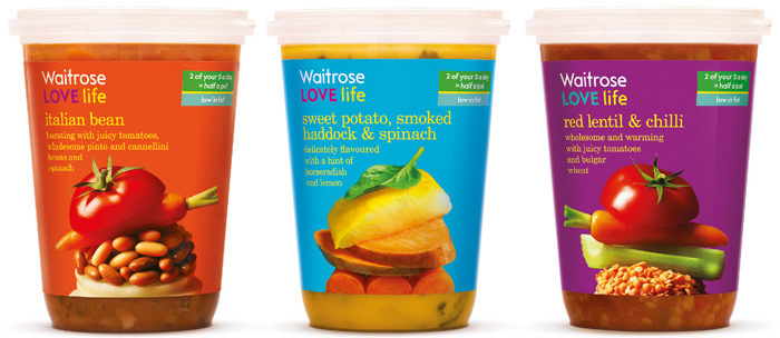
Less calories = much healthier
The new consuming decisions have changed and redefined the category of products related to health care. The awareness about nutrition and the interest about functional benefits favoured the creation of brands based on the communication of wellbeing more than on weight loss. However, there are many products that are not precisely recommended to lose weight that have been adapted to the new era. This could be done by means of informative graphics about nutritional values on the main face of the package. Many of them do this to reveal that they are not as caloric as people might think.
In the past, the universe of low-calorie products or healthy food was usually related to deprivations from pleasure. These days all of them look as tempting, tasty and even healthier as any other product and this is the most important matter. The only way to seduce and appeal to the consumer effectively is by making the right decisions of graphic and structural packaging design. Design has the key to create enhancing and eye-catching packaging designs.
Be natural, be honest
Consumers are sure that they do not want artificial or chemical ingredients, and food producers are aware of that. The growing demand of better products and nutrition quality has also raised the expectative about packaging design. A low quality packaging is perceived as a bad quality product, no matter what there is inside. Packaging design is decisive to create precise messages to achieve what the brand wants to communicate.
The different strategies and new models of communication that have appeared lately, aim to convey the sensation that the product we are buying will not only be delicious, but also healthy and it will help us to get good nutrition. Packaging design creates the promise and makes it visual in a graphic message that goes together with the sensorial experience created by the shape and material of the package. This may seem obvious, though this strategic decision sometimes is not taken into account. Shape and materials of a package are essential to improve a complete multi-sensorial experience, and this will become part of the brand´s equity.
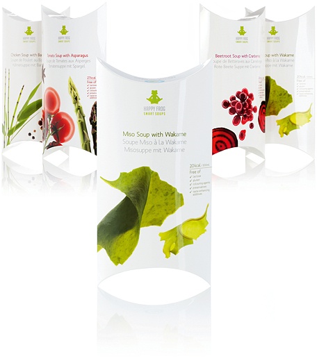
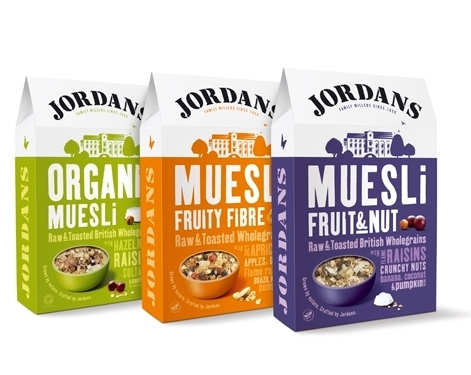
There are many graphic resources in healthy foods and beverages graphic design to achieve its goals. One of the key elements are photographs with soft white illumination, which create a natural «look and feel». Another important point is using white space as a design decision and not as the consequence of emptiness. It is important to use it thoroughly, otherwise it could be perceived as an incomplete design. Every negative packaging aspect that consumers perceive will have an effect on their trust about the product. White space symbolizes purity, a direct speech which does not want to distract with decorative ornaments. The usage of white background has created a new visual language.
Beautiful imperfection
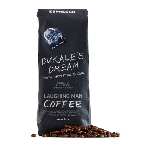
The new packaging design trends are not only a set of graphic resources; another major change is the style of the package texts. Every day there are more and more products with colloquial claims and phrases on the front panels, as if the package were a friend, as someone who speaks sincerely. This is called «verbal branding». Brands use this to approach consumers in a more relaxed and friendly way, in a low tone of voice. Capital letters yelling «BUY ME» are history. The new brand strategies aim to represent consumers’ interests more than their own.
Healthy food and beverages are no longer a synonym of boredom and dullness. Moreover, consumers prefer natural authenticity than industrial perfection. Health care and wellbeing are not probable to be out of fashion in the future. For that reason, food producers and packaging designers will face the need of a new revolution to find new roads and keep on surprising consumers.
Professional Excellence
If you are looking for content with this level of rigor, you will be interested in our academic offer. Courses designed to meet the real demands of the profession.
View Academic OfferShare
Please value the editorial work by using these links instead of reproducing this content on another site.

Topics covered in this article
What do you think?
Your perspective is valuable. Share your opinion with the community in the discussion.
Comment now!