Minimalist Packaging
Minimalism requires to decide on what is really necessary from what is not.
Featured Contribution
- Comments:
- 4
- Votes:
- 14
- ES
To be truly minimalist, this article should end at this very point. Paradoxically, this text needs to be more extensive to explain this article title. Minimalism is the result of a complex synthesis that requires a thoughtful analysis. In the process it is better to start with as many resources as possible and carefully select what is really important and necessary.
Minimum Definition
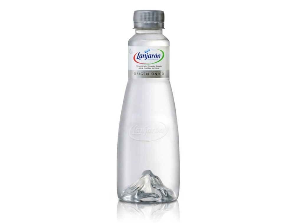
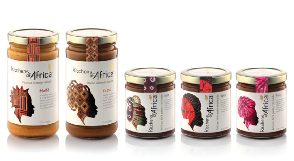
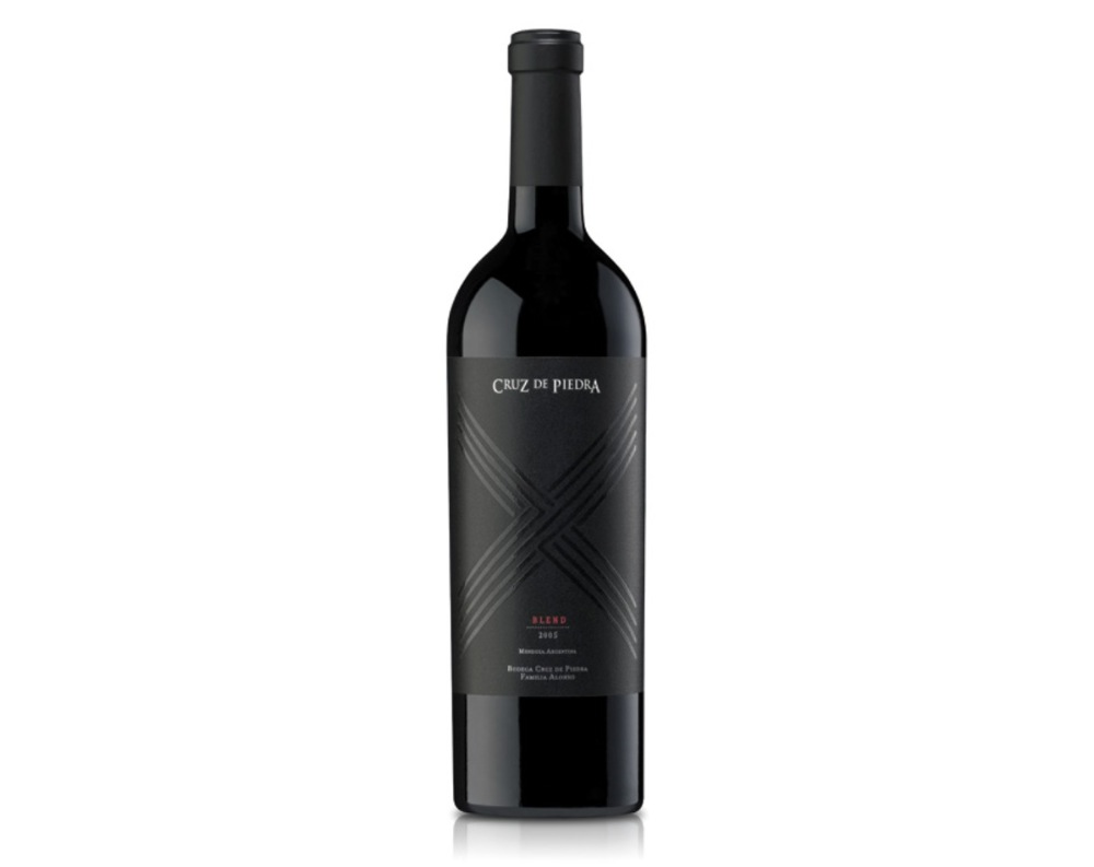
As defined by Wikipedia, minimalism refers to anything that has been reduced to essentials, stripped of excess. In packaging design we could say that these elements, rather than remaining, would be those that are not strictly necessary to understand the brand and product message.
3D packaging identity consists of two main parts: Structural and Graphic Design. Minimalism has its own characteristics in each:
-
Structural Design: The physical hardware. Simple and pure forms, easily recognizable silhouettes.
-
Graphic Design: Text and images. The minimal ornamental resources, little text and a simple color schemes.

Minimalist Culture 2.0
Minimalism is an inevitable consequence of the 2.0 culture, where virtual information is updated rapidly and constantly. Social networks like Twitter force us to minimalism with only 140 characters and this is also extensive to all kinds of visual messages. Whenever we can handle much more information in less time and developed a knack for ignoring the visual noise around. For example, we listen to music and ignore other noises, focusing all our attention on what we are listening. The same applies to visual messages. We have visual and auditory selective attention.
Designers must understand and design on behalf of these cultural shifts if they want to get visual messages received. Is necessary to be simple and straight to create efficient and clear messages. Complex and difficult to decode messages will be quickly ignored.

What Less, What else?
What we must first do is to analyze and classify the amount and quality of information. Consumers should make multiple purchase decisions in a matter of few seconds each time they go to a supermarket. It is a hard and time-consuming task and should be more rewarding than frustrating. The famous statement «less is more» I would change it into: «Less quantity and more quality of information.»
Consumers need to make buying decisions quickly absorbing the least amount of information possible. This increases confidence on the brand while creates an emotional bond between them.
Minimalist design not only facilitates the assimilation of information but generates greater visual impact, attracting the attention of the busy consumers and making easier the difficult task of deciding which product to buy in just a few seconds.

Massive Trend
Luxury cars, perfumes, jewelry, cosmetics and many others have been traditionally appealed to minimalism. A sober and sophisticated packaging identity was built though nowadays it is no more exclusive property of such brands intended for wealthy shoppers.
Truth is minimalism it not only a design strategy for premium products but a real influence in mass consumption. Generally, minimalist packaging designs tends to be perceived as noble and reliable products, however, in each category represents different virtues of each.

Final Summary
Minimalist design process is the opposite of what it may seem: it is the result of an extreme synthesis effort. To make a summary of a book, first you have to read everything. It should not be too long nor too short. You must have the right content to get an idea of what is.
Design is an activity that should encourage and simplify the human beings lives. If the consumer gets what they need to know in the shortest time possible, surely the design is effective.
Boost your career
Don’t just stop at reading. Discover our updating and specialization programs to take your professional profile to the next level.
View Academic OfferShare
Please value the editorial work by using these links instead of reproducing this content on another site.

Topics covered in this article
What do you think?
Your perspective is valuable. Share your opinion with the community in the discussion.
Comment now!


