Every Logo Should Be…
Twelve supposedly «universal» rules in brand identity design.


Editor's Selection
Decades go by – almost a century – and in professional branding circles (not to mention academic circles) we keep hearing staggering claims, openly contradicted by the facts. In large sectors of the discipline, work keeps being ruled by hard-to-eradicate myths: preconceived ideas, by their own nature, don't listen to reason or fact. See here twelve classic examples of professional mythology:
-
Every logo should refer to the organization activity or its product identity.
FALSE: yes, in some instances; not, in an ample majority.
-
Every logo should include a graphic symbol to complement its wordmark.
FALSE: in some instances the symbol is essential; in others, superfluous; in a few, optional.
-
Every logo should be unique, not answering to conventional graphic codes.
FALSE: in some instances the logo should be unique; in others, absolutely conventional.
-
In every logo, the wordmark should be manipulated, or the lettering or its correlation between them should be altered.
FALSE: in some instances, transgression of typographic or calligraphic norm is helpful, and in others, harmful.
-
Every logo should be amiable, informal or colloquial.
FALSE: only in some instances the informality of the logo can coincide with its best organization or product profile.
-
Every logo should be modern, adjusting itself to contemporary graphic standards.
FALSE: inherent to current «contemporary style» is its diversity; and some logos should be truly «classic» o, even «retro».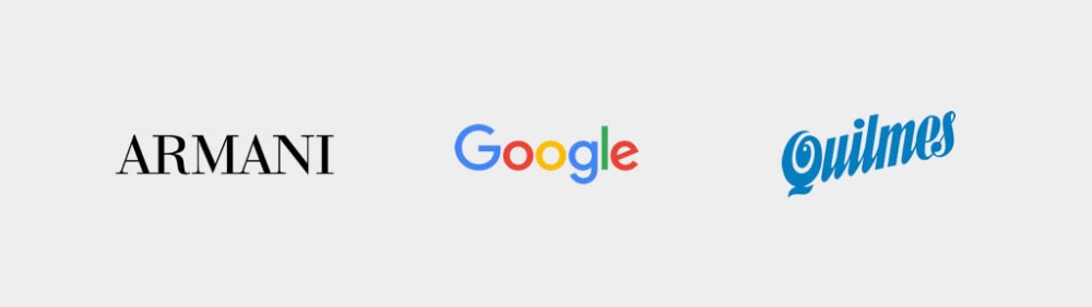
-
Every logo should adhere to the latest graphic trends.
FALSE: only logos of ephemeral organizations could adhere to ephemeral languages: obsolescence is rarely beneficial.
-
Every logo should be «renewed» periodically.
FALSE: its redesign can only be justified when low quality or a loss of competitiveness is detected.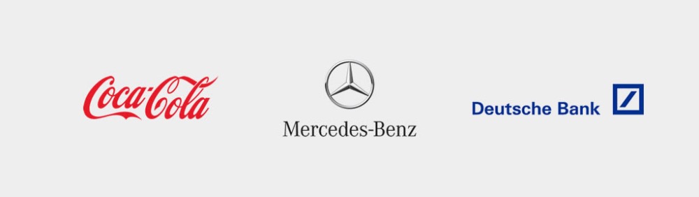
-
Every logo should be «dynamic» or be designed to modify its form.
FALSE: it only should be «declinable» when the diversity of activities calls for articulate sub-brands.
-
Every logo should adjust to the public profile.
FALSE: The logo should reflect its owner's profile (the organization or the product) and their offering is what should be palatable for its targets.
-
Every logo should be «sales-inductive».
FALSE: logos with advertising claim function can only be found in some impulsive buying instances.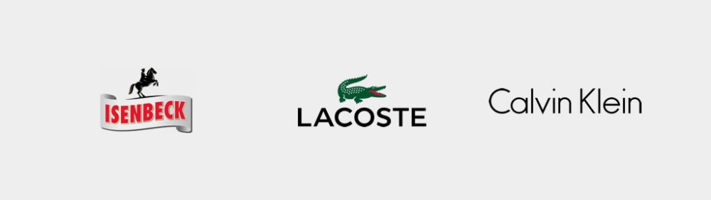
-
Every logo should be simple and memorable.FALSE: in many cases it must be; when the demands of speed of reading and memorization are a priority. In other cases, such a requirement is superfluous.


Corollary
Professional logo design is always specific, not subject to supposedly universal norms or prescriptions. It must be handled according to each case: it should detect the particular alternatives arising from the strategic profile and specific communication conditions. In all twelve preceding hypothesis, its falsehood comes from the word «every», that is, the presumption of universality to the respective norm.
Professional Excellence
If you are looking for content with this level of rigor, you will be interested in our academic offer. Courses designed to meet the real demands of the profession.
View Academic OfferShare
Please value the editorial work by using these links instead of reproducing this content on another site.

Topics covered in this article
What do you think?
Your perspective is valuable. Share your opinion with the community in the discussion.
Comment now!