Differences between monogram, logomark, symbol, wordmark, and other types of logos
Typological Thinking in Logo Design
A key requirement for effectively evaluating and creating logos and brand marks.


Editor's Selection
When meeting a colleague at the airport, to spot them in the crowd, I focus only on men, and since my colleague is a mature man, I overlook younger individuals. By scanning the gray-haired heads from a distance, I can quickly identify them. This reflects the mind’s natural behavior: its ability to classify, clearing the path to find what it seeks. Recognizing an individual identity always starts with identifying the type. In logical terms, the type—or class—provides the broadest, initial traits of the individual.
The same principle applies in graphic communication. Before pinpointing the specific movie promoted on a poster, I can tell from afar that it’s a movie ad, not, say, a fashion ad. Every message signals its genre through the appropriate graphic code. A logo or message without a genre, not rooted in a specific visual language, is slower to decode. The genre—or type—offers preliminary cues that allow the viewer, before engaging with the message’s content, to choose the right interpretive framework.
This holds true for brand identity as well: a law firm’s logo cannot share the same type as an oil company’s logo. Logo types identify the entity before its specific mark is even read.
The design process mirrors this decoding process: every logo design begins with identifying the relevant type or types. The initial stage of logo creation is verbal: “This company needs a purely typographic logo and an iconic symbol, or perhaps an abstract one.” The “hesitation” in this statement highlights that typological guidelines are not always rigid. The influence of the type varies based on factors such as:
- The industry: sector-specific logo types to follow or avoid.
- The name: length and structure of the brand’s name.
- Viewing conditions: distances, speed, and media.
- Brand architecture: single or multiple interconnected logos.
- Etc.
Even in cases with greater creative freedom, certain logo types will always be more effective, even if they can’t be predetermined. An initial typological exploration — testing generic solutions (with or without a background, with or without a symbol, with or without graphic elements), without diving into detailed design — will make the most suitable type stand out.
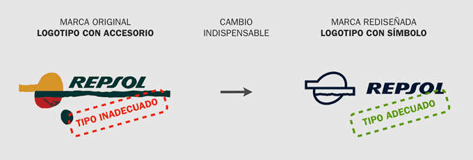
In essence, no matter how flawless, a logo’s design cannot salvage a brand mark that is typologically flawed. Let’s examine some real-world examples:
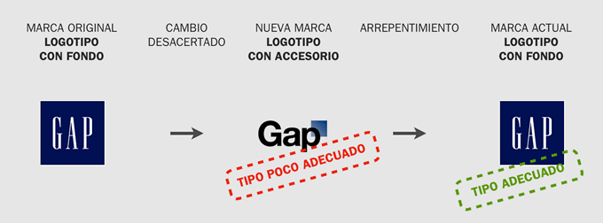
Now consider the GAP case:
Finding the right logo isn’t just about creativity — it’s about common sense: honing taxonomic and classification skills to select the appropriate type before designing. Typological selection starts by comparing the organization (its identity and communication needs) with the six — and only six — logo megatypes.
Each of these megatypes contains an internal typology, offering nuances for finer selections that define the logo with greater precision and alignment to the specific case. Hybrid types also exist, their generic identities “flickering” as the viewer prioritizes certain features. A “wordmark-with-background” (or “logotype-with-background”) depending on the background’s design, may resemble a “logo-symbol,” while a “wormark-with-accessory,” based on the accessory’s traits and usage, may align with the “symbol-with-wordmark” type.
The range of possibilities is vast. Using a method of progressively eliminating irrelevant types allows designers to quickly identify the most fitting types and subtypes, enabling deeper exploration of internal variants. This elevates the final quality of the logo design.
Many “poor logos” fail not because of low-quality design but because the wrong type was chosen. Without prior typological analysis, designers often jump into creating logos based on preconceived formulas or biases that assume a type is inherently suitable.
Once the right type of logo is selected, another layer rich in possibilities emerges: style. Two logos of the same type can embody contrasting graphic styles. Style, alongside type, is a defining trait that most vividly conveys brand identity, far more evocative than the mark’s potential semantic content. But that’s a topic for another discussion.
Following this text’s publication, Luciano Cassisi further explored types of logos characterization in his article How to Choose the Right Type for Your Logo.
Professional Excellence
If you are looking for content with this level of rigor, you will be interested in our academic offer. Courses designed to meet the real demands of the profession.
View Academic OfferShare
Please value the editorial work by using these links instead of reproducing this content on another site.
Topics covered in this article
What do you think?
Your perspective is valuable. Share your opinion with the community in the discussion.
Comment now!