How to Choose the Right Brand Mark Type for Your Logo
Understanding the strengths, limitations, and characteristics of brand mark types helps determine which one — or ones — best fit each logo design project.


- Comments:
- 0
- Votes:
- 0
In the article Typological Thinking in Logo Design, Norberto Chaves introduces a logo typology (developed collaboratively with Raúl Belluccia and myself) that, while seemingly obvious to many, brings clarity to a surprisingly underexplored topic. Every day, countless logos are designed and redesigned worldwide, underscoring the need for a basic conceptual framework to enhance the effectiveness of those managing branding programs and designing logos.1
The challenge of typology permeates every decision-making process, even in daily life. When dressing for a specific occasion, certain items in your wardrobe are immediately ruled out based on the event. For instance, for a formal gala, you’d discard all shorts, beach sandals, and other garments, shoes, or accessories entirely unsuitable for the occasion. Similarly, for a picnic, you’d rule out suits, starched shirts, ties, and so on. While shorts come in various styles—some more formal than others—no pair of shorts is appropriate for a black-tie event. Just as some garments are suited only for specific occasions, others, like underwear, certain shoes, shirts, or jackets, are highly versatile. There are also garments, accessories, and footwear designed for specific sports, while others, though stylistically fitting, may be impractical (uncomfortable, overly warm, etc.) for certain uses.
The same applies to brand mark types in logo design. Each type offers unique strengths and limitations, making it more or less suitable for specific logo projects. Let’s explore a general characterization of each type to equip branding professionals with tools to decide, before designing, which brand mark types are appropriate for a given logo and which are not.
Key Clarifications
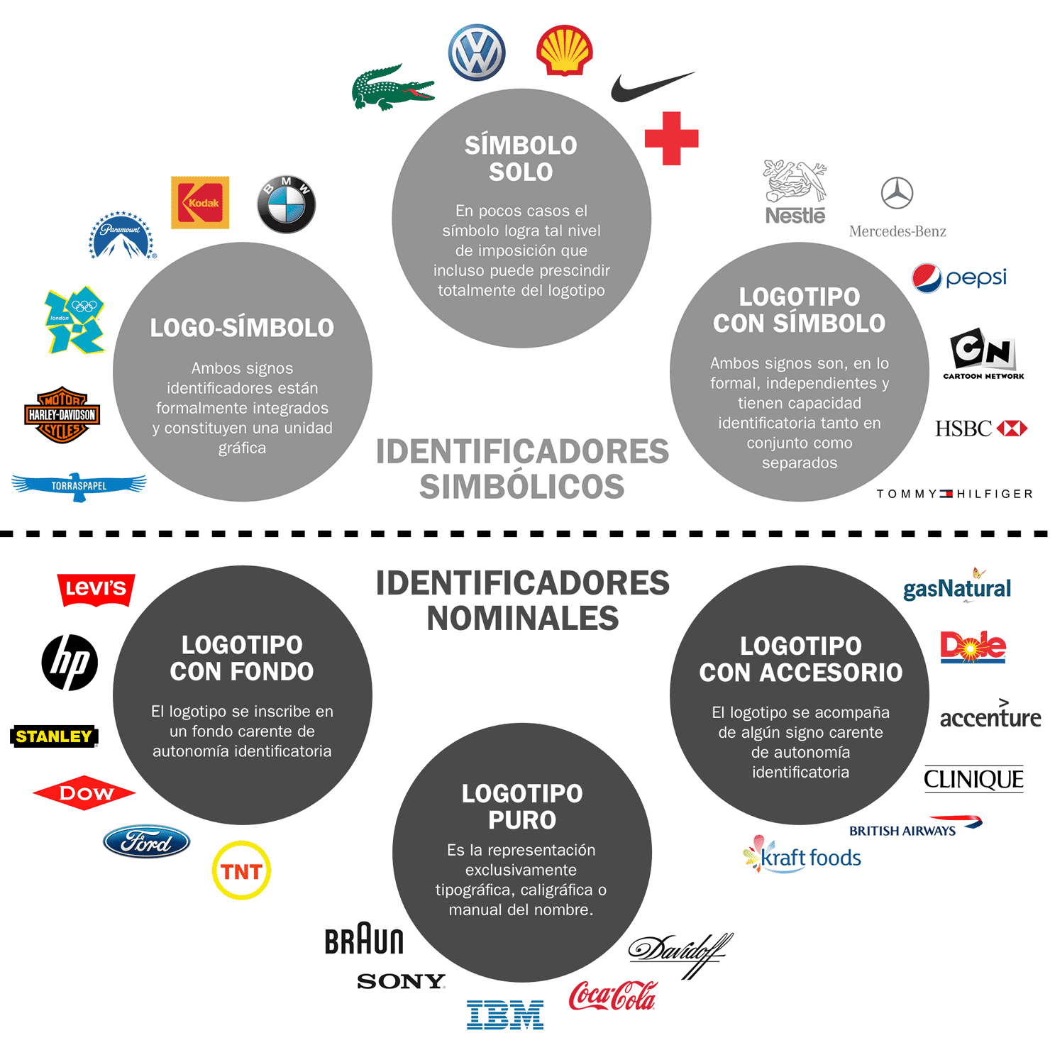
As shown in the diagram, a clear line separates two distinct groups of brand mark types: symbolic types and nominal types. It’s important to consider this grouping, as types within each group share certain characteristics.
It’s also worth noting that the six brand mark types don’t encompass the entire range of existing logos, nor do they have rigid boundaries. You may encounter logos in transitional zones between two types or combinations not shown in the diagram, such as “wordmark-with-background-and-accessory,” “wordmark-with-symbol-and-accessory,” or “logo-symbol-with-accessory.” For studying logo typology, we can set aside these hybrid types and focus on the “purer” ones.
The following characterization highlights some observed strengths and limitations of each brand mark type. This is not a scientific or exhaustive study, so specific cases may occasionally contradict these observations.
Pure Wordmark
Except for the rare “symbol-only” logo, which only a few brands achieve after years of establishing recognition, all brand mark types include a wordmark. With those exceptions, there are no logos without a wordmark. Thus, the “pure wordmark” is the only type “without additions”—the most straightforward, natural, and simple to establish, as it relies solely on the name. A viewer needs only to read to associate the logo with its phonetic equivalent, often heard in media like radio. There’s little new to learn beyond the typeface and color.
However, this type demands a strong name2—easy to read, pronounce, and remember. For the wordmark itself, fewer letters and words make it easier for the logo to be perceived as a brand mark, achieving what we call “brand character.”3 Consider two extreme examples:
- A name with thirteen words, like “Chamber of Commerce and Industry of the Eastern Republic of Uruguay in Lima,” even if arranged in one, two, or three lines, cannot be instantly recognized as a wordmark without reading. In such cases, it’s often better to discard the pure wordmark and opt for other brand mark types to address the name’s significant challenges.4
- Conversely, a name with two, three, or even four letters, if well-crafted, easy to read, pronounce, and recall, almost certainly results in a wordmark with strong brand character, rivaling the qualities of a graphic symbol (discussed later).
Wordmark with Background
This type inherits all the traits of the pure wordmark. The background’s primary contribution is enhancing the logo’s brand character, though this depends on the background’s design.5 By “background,” we mean both solid color fields behind the wordmark and outlined shapes enclosing it. Solid backgrounds offer two clear advantages:
- Regardless of the color, they typically increase the printed surface area, enhancing the logo’s ability to showcase the brand’s color palette.
- A solid background ensures consistent legibility across all applications. Whether applied on a plain white surface or a complex, multicolored one, the background maintains a uniform relationship with the wordmark.
In summary, a “wordmark with background”—when the background has distinct character—generally outperforms the same wordmark without a background in several ways:
- Greater visual impact
- Stronger brand character
- Higher memorability
- Better recognition at a distance
- Consistent reproducibility
However, wordmarks with backgrounds can have drawbacks:
- They may be less effective or harmonious in applications like borders, marquees, website navigation bars, or other spaces with limited dimensions.
- They can constrain the style of elegant or institutional messaging.
Wordmark with Symbol
From the characterization of the pure wordmark, we can infer the strengths and weaknesses of its near-opposite: the “wordmark with symbol.” Once established in its context, a symbol offers unique advantages, shared only with wordmarks of very few letters and certain logo-symbols:
- Support for brand architecture. A single symbol can unify multiple units within an organization. For example, a shield or emblem can better support the brand architecture of a country, province, state, or city’s official entities than a written name. A corporate group can use the same symbol across its companies, creating clear associations and communication synergy. Note that in most cases, where such needs don’t exist, this advantage is irrelevant.
- Greater attention-grabbing and memorability. While not universal, graphic symbols generally draw more attention and are easier to recall (as shapes) than wordmarks.
- Emblematic potential. Since symbols can often function separately or independently from the wordmark, they can serve as emblems, identifying the brand in contexts where the name is less practical—e.g., car grilles, clothing buttons, linings, bag zippers, or airplane rudders. This emblematic quality can inspire rich graphic systems, though in many cases, it offers no significant advantage.
Wordmarks with symbols also have common drawbacks:
- Challenging establishment. To leverage the above advantages, a symbol must first be established as synonymous with the name—a process that is neither quick nor easy. Without a symbol, this step is avoided. The difficulty depends on the organization’s ability to deliver branded messages. Brands with limited reach, whether mass or niche, may struggle to establish a symbol.
- Complex application. Positioning a two-element composition is harder than placing a single element in the same space. Depending on the symbol-wordmark relationship, more surrounding space is often needed, making this type harder to apply than most others.
- Difficult maintenance. To address the above issue, wordmarks with symbols often use multiple configurations—e.g., “symbol left, wordmark right” for horizontal spaces (like marquees or website headers) and “symbol above, wordmark below” for vertical ones (like public totems). This variability complicates long-term logo management: if a single version is hard to use correctly, multiple versions multiply the challenges.
Wordmark with Accessory
Given the variety of possible accessories, fully characterizing this brand mark type is challenging. However, depending on the accessory, its strengths and weaknesses align with those of related types. If the accessory resembles a symbol, consider some traits of the “wordmark with symbol,” excluding its ability to function independently. If the accessory is minimal, the traits of the “pure wordmark” apply. If it’s prominent (e.g., a thick underline), some characteristics of the “wordmark with background” are relevant.
Logo-Symbol
This brand mark type combines advantages of other types:
- It is essentially a wordmark with a background, inheriting all its strengths.
- By including a symbol, depending on its prominence, it can leverage some benefits of the wordmark with symbol.
- Like all nominal types, it’s a single, consistent logo with no variants, maximizing the power of repetition. This can be a strategic advantage in some cases and irrelevant in others.
However, logo-symbols can pose issues similar to those of wordmarks with backgrounds, exacerbated when the logo has roughly equal width and height, which is common. In such cases, legibility may suffer in certain applications. For example, applying the Burger King logo-symbol to a border may render the wordmark too small. The typical solution is to create a separate wordmark used alongside the logo-symbol, as if the latter were a symbol. In Burger King’s case, their store borders feature a wordmark with the same typography next to the logo-symbol.
The Relationship Between Type and Graphic Style
In logo design, another closely related decision—often confused with type selection—is choosing the graphic style. This critical aspect, though widely discussed in professional and academic circles, is distinct from type. The confusion likely arises because brand mark types are often considered through their dominant, paradigmatic stylistic models.
Consider an example: commercial logos needing strong distance recognition, high memorability, and visual impact often use a “wordmark with symbol” in styles with saturated colors, high contrast, and simplified forms. While this type-style combination is common and effective, it shouldn’t imply that all wordmarks with symbols must follow this approach. A wordmark with symbol using muted colors and complex forms can offer opposite traits (lower memorability, visual impact, and legibility) yet still be an excellent solution for a law firm, a low-profile professional association, or a government entity engaging primarily with other institutions, not the public.6
The type-style duo always works together, so both should be defined simultaneously, clearly distinguishing which needs the type addresses and which the graphic style resolves.
How to Determine the Right Brand Mark Type
We’ve clarified some characteristics of brand mark types and their relationship with style. While there’s much more to explore, this provides a solid foundation for understanding typological challenges in logo design more deeply.
Selecting the right brand mark type isn’t an exact science, and this text is far from advocating rigid rules. Instead, it proposes moving away from creative mysticism and intuition, defining the brand mark type based on case-specific variables:
- The logo’s practical application needs (where it will be used and what functions it must serve).
- The name’s characteristics (its quality and length).
- The dominant brand mark types among competitors and comparable entities (evaluating their successes and failures in use).
From this blend of variables, you can determine which brand mark types to adopt or discard. However, a good type selection doesn’t guarantee success—it merely leverages the type’s strengths while accepting its limitations.
It’s not always possible to pinpoint one ideal type with certainty. It’s often easier to identify which types are unsuitable compared to those that, for specific needs, appear most appropriate a priori. In some cases, any type with the right style may work, but analysis must still precede graphic exploration to avoid wasting time on fruitless paths. I delve deeper into this topic in the seminar Brand Mark Typology, co-taught with Norberto Chaves.
What do you think? Share your comments right now!
- Comments:
- 0
- Votes:
- 0
- Until recently, selecting a brand mark type wasn’t even considered part of logo design. Even today, for many experts, a “pure wordmark,” “logo-symbol,” or “wordmark with symbol” are choices left to whim or, at best, sensitivity, as if any type were equally valid for any logo.
- The name is usually a given and rarely changeable. We won’t delve into what makes a good name, as that’s a broader topic.
- “Brand character” shouldn’t be confused with memorability or visual impact. A logo has brand character when it’s consistently recognized as a brand mark across applications, not as another type of graphic element.
- For long names, acronyms are often the best way to establish a logo within the brand genre. However, creating an acronym isn’t purely a graphic decision—it involves a name change, which may be rejected by the organization or hindered by an unfavorable letter combination. When feasible, an acronym can either replace the long name or complement it. In the latter case, the acronym may function like a symbol in a “wordmark with symbol.” Thus, it’s generally inadvisable for a logo combining an acronym and its explanation to include a third element, like a symbol, unless the abundance of identifiers adds value.
- Simple shapes like circles, squares, diamonds, or ovals are particularly effective as backgrounds for logos, likely explaining their prevalence (and no less effective for it). Less geometric backgrounds often add uniqueness, sometimes pushing the logo toward a logo-symbol, as seen with Levi’s background.
- A “wordmark with symbol” can be a suitable solution to give brand character to a multi-word name, even if the entity doesn’t need the symbol’s other benefits.
This article does not express the opinion of the editors and managers of FOROALFA, who assume no responsibility for its authorship and nature. To republish, except as specifically indicated, please request permission to author. Given the gratuity of this site and the hyper textual condition of the Web, we will be grateful if you avoid reproducing this article on other websites. Published on 07/24/2025