
Servicio de auditoría de marca y hoja de ruta para directivos que buscan optimizar el rendimiento de su marca como activo de negocio.
San Luis Potosí Mexico
Profession: A Communication Expert
Specialization: Comunicación corporativa
Joined FOROALFA: 2010
Servicio de auditoría de marca y hoja de ruta para directivos que buscan optimizar el rendimiento de su marca como activo de negocio.
Feb 2011 I like the article:
Jan 2011 My opinion in the article 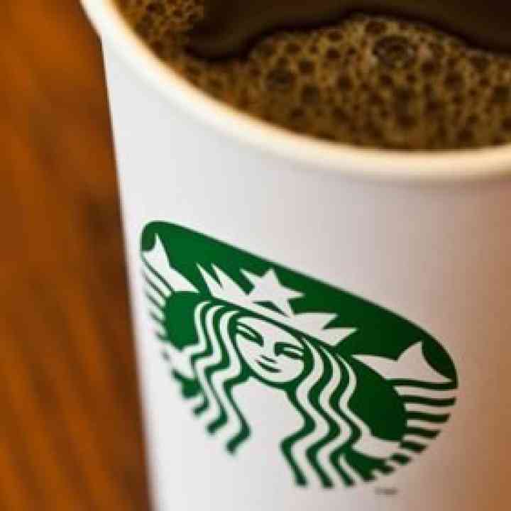 Starbucks: ¿mejor o peor?
Estoy de acuerdo con algunas cosas y con otras no, en primera es una melusina (espíritu del agua) no una sirena con las piernas abiertas, la decisión de eliminar la tipografía proviene de la oportunidad de entrar en el mercado asiático sin tener que adaptar la tipografía al idioma como lo hace coca-cola. Marcas como apple, Niké, shell tienen imágenes rotundas simples y de fácil reconocimiento, la imagen de starbucks no es rotunda ni simple es un buen ejercicio estético pero aun lejos de las marcas con las que se desea comparar.
Train with the experts from our community.
View Courses (in Spanish)Refreshing courses to specialize with the best.

Keys for programming the design of high-performance logos and graphic symbols
20 hours (approx.)
Noviembre
Criteria and tools for selecting the right type of logo in brand design
15 hours (approx.)
Noviembre
Analytical guide and working method for determining rebranding strategies
15 hours (approx.)
Diciembre