Vindicating Handwriting
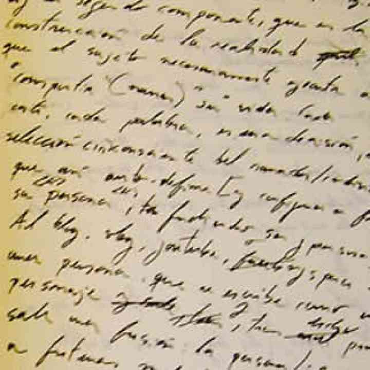
Design is often associated with normalization and sterilization. But handwriting is still a good way to reconnect with our roots and recover vitality.

Featured Contribution
- Comments:
- 0
- Votes:
- 2
- ES
One of the most common problems on the practice of design, specially at the beginning, is the willing to design everything. Nothing can be random, everything must be set out – and the results are overdesigned, saturated pieces in which arises a confusion between loudness and greatness, like in mainstream music and… our whole mainstream culture. Is this really the way to achieve excellency, to get sound and durable results?
It is hard to achieve balance. Even more when design tends to separate more than unify, given his rational and defining nature. This is painfully true to the scatterbrains who wants a design which is both bluish and warm… We cannot have everything, but many of us deny it and keep trying to achieve the impossible, with the result of an increasing frustration. It comes in different flavors: writer’s block, too many ideas and just one pencil, a perfect plan which goes to hell with the first setback… The desire of a total control can only bring disappointment because it puts an excessive weight on our shoulders: the weight of trying to live up to our fantasy.
To design is to project objects, mechanisms, structures… which offers the best functionality at the lowest cost possible. To be effective on this task we have to respect the principle of reality, we have to acknowledge the richness and variety of reality, but sometimes we overlook this because the fantasy of total control is too much suggestive. Thus, we build and rely on simplified, limited visions. The less our trust on reality, the more limited and simplified our vision will be, but the cause, and the result, are the same: poverty. Maybe not a poverty in the execution, but clearly a poverty of character, of concept, of essence. A designer is, in a way, a ruler, and if he acts like a dictator he can only expect a coward, mediocre output.
It is critical to accept reality with all his variety and exuberance. Which is more desirable: to make everyone equal by reducing them to a common minimum or to let everyone give the best he can? Taking this to the typographic field, the serif fonts, or at least the ones with a characteristic shape, are more flexible means for ideas and feelings than the swiss ones. I know this is controversial, because fonts like Helvetica have been used successfully in all kind of situations, but should we apply the same recipe to everything? Does not that limits and trivializes both the messages and the very profession? Why would the world need designers if everything was limited to black Helvetica letters upon white backgrounds? Which need would be of Humanity if we were just machines?
A Human Need
Beyond the discussions about legibility and ease of understanding of this or that style, personal styles are a Human need. I can imagine the people of Babel abandoning the building of their Tower not because of a Divine curse, but because of the sudden comprehension that there were still too many things to discover and learn here on Earth. How could we be satisfied with just one language when there are myriads of them waiting to be discovered and invented?
There are traditions which speaks about the need of living our life here and now before leaving for another time and place – and certainly, how are we going to live the day of tomorrow or the beyond when they come… if we are not able to live this very moment? This is an invitation to put fantasies on their place, which they surely have, but surely it is not to replace our attention and experience.
I do not know how things will be in another realities, be they Matrix, Shambala or the Flying Spaghetti Monster’s kingdom, but it is easily noticeable that there is a growing variety and richness around us. Things just keep growing and happening. Why would we want to simplify and homogenize them all? Difference does not mean separation nor confrontation, but a chance to learn.
That is why I do not support that “design everything” philosophy. I do not think that it is the function of this profession. Design, like every creative activity, has the purpose of showing the reality of things. And reality is not something twisted nor overacted. Things, as it is highlighted in the Zen, Tao and the like, have an spontaneous and straightforward essence. Our work as creatives is more complete and satisfying when we simply let things express themselves.
For instance, one thing is to retire the weeds which slows down the flow of a stream. Another very different thing is to lock its water in a pipe. I am not saying that we should not use pipes, just that the function of that very stream could be to flow in the open. If it is so, there will be not good enough pipe to alleviate that stream’s misery.
Regarding letters, it is a pity that the practice of the calligraphy is limited more and more to a few lovers. I am not talking of a formal calligraphy, but of a personal, intimate, everyday calligraphy – handwriting. That writing you use in the shopping list, to take notes at the school or to scribble on your diary. That letter which only you can trace and, even in the dullest text, tells something genuine about you through every curve, every ligature, every shape… And the genuine is beautiful, is moving, no matter how strange, clumsy and imperfect could it be, because it is real. It is not a pose nor the result of a marketing plot: it is what it is.
Concluding
Too often, designing has involved making up and trying to revive corpses. And, while that requires skills and can be a challenge, it lacks space for surprise and learning. It is enough! My belly longs for spontaneity, authenticity, growth… Something that I won’t be able to fix just changing my favorite font for a new one, or jumping on the current trend. One will not mend his sadness eating ice cream. This is no longer about covering and disguising, but about revealing once and for all.
So let’s go back to handwriting, doodling, sketching… Not something planned, not something to glorify that character that we would like to be. No. I’m talking about how we write when we have spare time, or when we are on a hurry, or digressing, or taking notes… I’m talking about how we write when we are too much busy to care about who we are, when we just are. Then, a deeper meaning appears. A meaning from which we can learn, because it is honest. Not a dream nor a fantasy: it is here, it is now, it is what it is. It is our truth, our chance of authenticity, our source of knowledge and growth, of life.
For this all, I vindicate handwriting.
Boost your career
Don’t just stop at reading. Discover our updating and specialization programs to take your professional profile to the next level.
View Academic OfferShare
Please value the editorial work by using these links instead of reproducing this content on another site.

Topics covered in this article
What do you think?
Your perspective is valuable. Share your opinion with the community in the discussion.
Comment now!


