Massimo Vignelli: Insights from a Master of Design
The Vignelli Canon, a Tribute
Though we can learn from many designers, few have left us a legacy more clear and visible.

Opinion Space
- Comments:
- 0
- Votes:
- 3
- ES
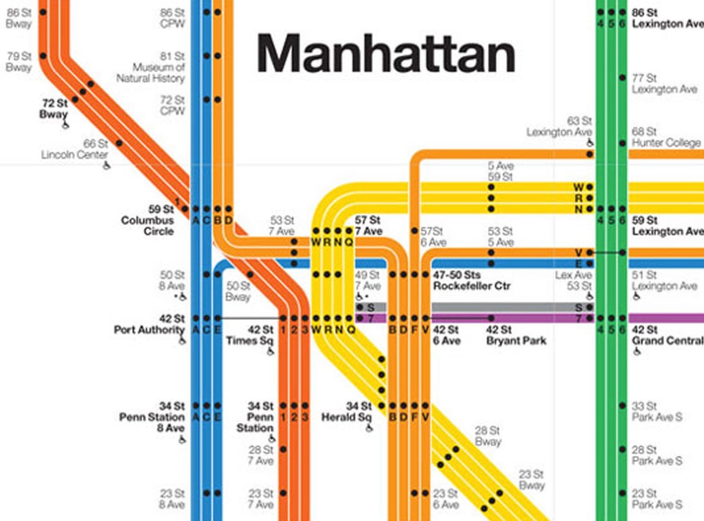
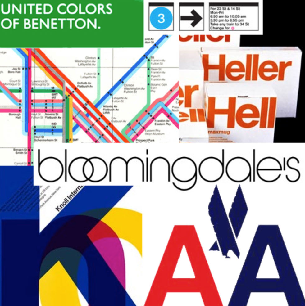
Massimo Vignelli’s first job was at Castiglioni Architects, in Milan, when he was 16. From that moment on he began to forge a career as one of the best designers in the 20th Century. Along with his wife —Lella— started Vignelli Design in New York, where he lived the rest of his life, working for such prestigious names as Saks Fifth Avenue or Bloomingdaleʼs. Impassioned for good design, he sustained that it should last forever, and proved it with logotypes that stayed with us for more than 50 years, as American Airlines and Knoll, or with designs as unique as the map of the New York City subway.

Nevertheless, one of the things that sets him apart is the legacy he left in what he called CanonVignelli, a writing where he states most of his thinking and conceptions about design. Timeless ideas apart from fashion or technology, making clear not to follow them literally. Canon Vignelli allows us to enter the mind of someone that lived design from its guts, and whose experience make this writing an invaluable inheritance.

Today, as kind of a tribute, we gather some excerpts from that text, with no pretense to sum up or interpret them, but rather as an invitation to download, read, and discern its contents, available for free to anyone interested.1
1. The intangibles
Semantics, syntactis and pragmatics
«I have always said that there are three aspects in Design that are important to me: Semantics, Syntactis and Pragmatic […]
Semantics, for me, is the search of the meaning of whatever we have to design. […] Eventually it becomes an essencial part of the designerʼs being, a crucial component of the natural process of design, and the obvious point of departure for designing. [...]
Syntactics Mies, my great mentor said: ‘God is in the details.’ That is the essence of syntax: the discipline that controls the proper use of grammar in the construction of phrases and the articulation of a language, Design. The syntax of design is provided by many components in the nature of the project. In graphic design, for instance, they are the overall structure, the grid, the typefaces, the text and headlines, the illustrations, etc.
Pragmatics Whatever we do, if not understood, y fails to communicate and is wasted effort. We design things which we think are semantically correct and syntactically consistent but if, at the point of fruition no one understands the result, or the meaning of all that effort, the entire work is useless. […] Any artifact should stand by itself in all its clarity. Otherwise something really important has been missed.»
Discipline
«The attention to details requires discipline. There is no room for sloppiness, for carelessness, for procrastination Every detail is important because the end result is the sum of all the details involved in the creative process no matter what we are doing. […] Quality is there or is not there, and if is not there we have lost our time. […] Discipline is a set of self imposed rules, parameters. […] Design without discipline is anarchy, an exercise of irresponsibility.»
Appropriateness
«Appropriateness directs us to the right kind of media, the right kind of materials, the right kind of scale, the right kind of expression, color and texture. […] I think that we have to listen to what a thing wants to be, rather to contrive it in to an arbitrary confinement.»
Ambiguity
«Rather than the negative connotation of ambiguity as a form of vagueness, I have a positive interpretation of ambiguity, intended as a plurality of meanings, or the ability of conferring to an object or a design, the possibility of being read in different ways – each one complementary to the other to enrich the subject and give more depth.»
Visual Power
«We say all the time that we like Design to be visually powerful. We cannot stand Design that is weak in concept, form, color, texture or any or all of them. We think good Design is always an expression of creative strength bringing forward clear concepts expressed in beautiful form and color, where every element expresses the content in the most forceful way.»
Timelessness
«We [in Vignelli Design] are definitively against any fashion of design and any design fashion. We despise the culture of obsolescence, the culture of waste, the cult of the ephemeral. We detest the demand of temporary solutions, the waste of energies and capital for the sake of novelty.
We are for a Design that lasts, that responds to peopleʼs needs and to peopleʼs wants. We are for a design that is committed to a society that demands long lasting values. A society that earns the benefit of commodities and deserves respect and integrity.»
Responsibility
«In graphic design the issue of responsibility assumes particular importance as a form of economic awareness toward the most appropriate solution to a given problem.»
Equity
«A real Corporate Identity is based on an overall system approach, not just a logo. A logo gradually becomes part of our collective culture; in its modest way it becomes part of all of us.»
2. The tangibles
Paper Sizes
«There are two basic paper size systems in the world: the international A sizes, and the American sizes. The international Standard paper sizes, called the A series, is based on a golden rectangle, the divine proportion. It is extremely handsome and practical as well. […] The United States uses a basic letter size of ugly proportions, and results in complete chaos with an endless amount of paper sizes. […] An example of the misinterpretations of freedom.»
Grids, Margins, Columns and Modules
«For us Graphic Design is «organization of information». […] Nothing could be more useful to reach our intention than the Grid. The grid represents the basic structure of our graphic design, it helps to organize the content, it provides consistency, it gives an orderly look and it projects a level of intellectual elegance that we like to express.»
Typefaces – The Basic Ones
«The computer allowed anybody to design new typefaces and that became one of the biggest visual pollution of all times. In order to draw attention to that issue I made an exhibition showing work that we had done over many years by using only four typefaces: Garamond, Bodoni, Century Expanded, and Helvetica. […] Besides those mentioned, I can add Optima, Futura, Univers (the most advanced design of the century, since it comes in 59 variations of the same face), Caslon, Baskerville and a few other modern cuts.»
White Space
«I often say that in typography the white space is more important than the black of the type. The white space on the printed page is the correspondent of space in architecture. […] White space, not only separates the different parts of the message but helps to position the message in the context of the page.»
Conclusion
«Throughout our creative lives we have sifted through everything to select what we thought best. We sifted through materials to find those for which we have the closest affinity. We sifted through colors, textures, typefaces, images, and gradually we built a vocabulary of materials and experiences that enable us to express our solutions to given problems – our interpretations of reality. […] As much as I love things in flux, I love them within a frame of reference – a consistent reassurance that at least and at last I am the one responsible for every detail. And that is why I love design.»
Massimo Vignelli died last May 27 at 83, in New York City. Undoubtedly he was and will be one of the most influential personalities in World design.
Specialized Training
Complement your vision with structured training. Our courses provide the technical and strategic tools that the current market demands.
View Academic OfferShare
Please value the editorial work by using these links instead of reproducing this content on another site.

Topics covered in this article
What do you think?
Your perspective is valuable. Share your opinion with the community in the discussion.
Comment now!


