
Servicio de consultoría y diagnóstico para alinear la identidad corporativa de su empresa con sus objetivos de negocio.

Peñaflor, Santiago Chile
Joined FOROALFA: 2009
Servicio de consultoría y diagnóstico para alinear la identidad corporativa de su empresa con sus objetivos de negocio.
Feb 2011 I like the article:
Sep 2009 My opinion in the article 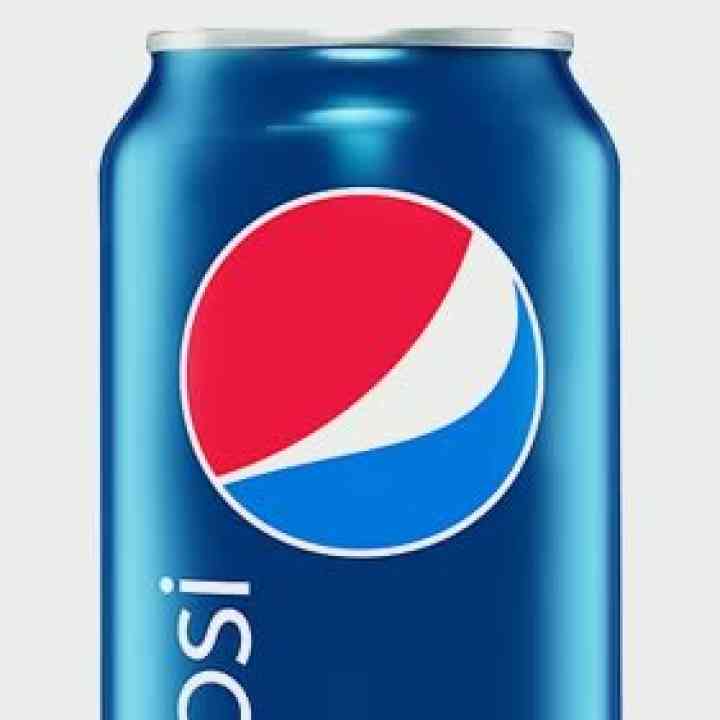 Pepsi: ¿mejor o peor?
De todas maneras me parece poco apropiada el nuevo Isologotipo. En primer lugar, pierde muchísima fuerza al sacar el volumen, no provoca, no hay una intencionalidad clara en su cambio, más que la de sumisión frente a la competencia. La tipografía tiene un cambio demasiado drástico que perturba, aleja y desequilibra el todo. Simplemente parece que asumieron su lugar, victimizándose y apocando su imagen.
Train with the experts from our community.
View Courses (in Spanish)Refreshing courses to specialize with the best.

Analytical guide and working method for determining rebranding strategies
15 hours (approx.)
diciembre

How to build professional authority and overcome the problem of convincing the clients when presenting designs to them
15 hours (approx.)
diciembre

Professional practice workshop: analysis, diagnosis and branding program on real cases
30 hours (approx.)
enero