
Eliel Fierro
Professional
Tijuana Mexico
Joined FOROALFA: 2011
- Followers:
- 0
- Comments:
- 1

Recent activity of Eliel Fierro
0
Feb 2011 I like the article:
0
Jan 2011 My opinion in the article 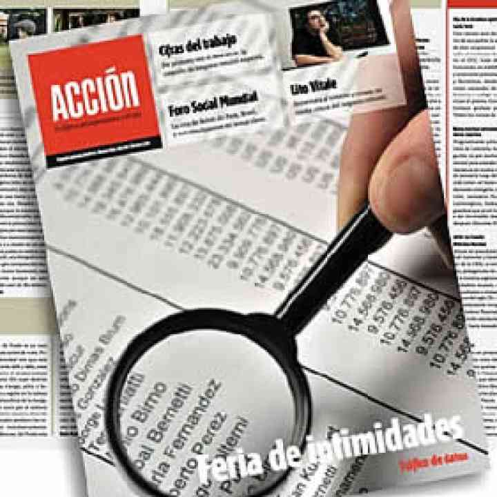 Rediseño editorial en Acción
Haciendo comparativo del logotipo anterior al nuevo, creo que se mejoro mucho, se mira mas estético y moderno. La portada esta bien trabajada un 10, pero con todo respeto creo que el interior esta muy saturado demasiado apretado, para mi criterio se debería de jugar mas con espacios en blanco, un poco más de aire.
Elevate Your Professional Level
Train with the experts from our community.
View Courses (in Spanish)